
Brands Fashion Editorial Campaign
1 / 2
ᴍᴜʀᴘʜʏ
@Diplomeme
2048.9K181217d agoText to image
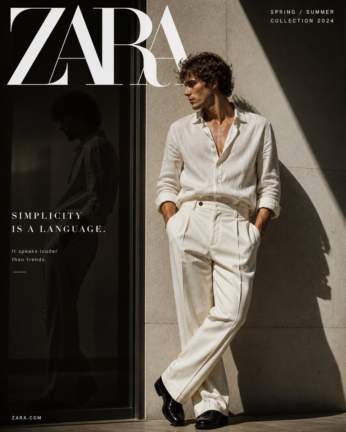
PROJECT TITLE: “SIMPLICITY IS A LANGUAGE”

BRAND: ZARA

FORMAT:
4:5 vertical, 8K, editorial campaign visual

STYLE DNA:
Minimal editorial × modern elegance × soft luxury × trend-aware restraint × high-street sophistication

PHASE 1: CORE IDEA
Style is not loud.
It is understood.

Minimalism as confidence.

PHASE 2: MODEL

- Male or female (20–30), sharp features
- Clean grooming, neutral expression
- Emotion: detached, composed

POSE:
- Leaning against wall OR standing still
- Hands in pockets OR relaxed posture
- Slight head turn (editorial feel)

PHASE 3: STYLING

- Neutral-toned outfit:
  → Linen shirt / relaxed tailoring / wide trousers
- Palette:
  → Off-white / beige / sand / muted tones

FIT:
- Contemporary (slightly loose, fashion-forward)

FABRIC:
- Light, breathable, soft folds

PHASE 4: ENVIRONMENT

- Minimal architectural wall (stone / concrete)
- Clean geometry
- Shadow play (important)

NO clutter

PHASE 5: LIGHTING

- Natural sunlight
- Hard shadow shapes (diagonal lines)
- High contrast between light & shadow

PHASE 6: TYPOGRAPHY

TOP:
ZARA (large, elegant serif)

SIDE COPY:
“Simplicity is a language.”

SUBTEXT:
“It speaks louder than trends.”

PHASE 7: COLOR

- Neutral monochrome palette
- Warm whites + soft shadows

NO strong accents

PHASE 8: CAMERA

- Lens: 50mm
- Editorial framing
- Clean composition, negative space

PHASE 9: MICRO DETAILS

- Fabric folds soft and natural
- Skin matte, not glossy
- Subtle shadow gradients on wall

PHASE 10: OUTPUT

- Feels like magazine editorial
- Quiet luxury, not loud branding
- Trend-aware but timeless